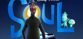

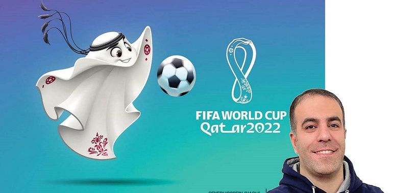
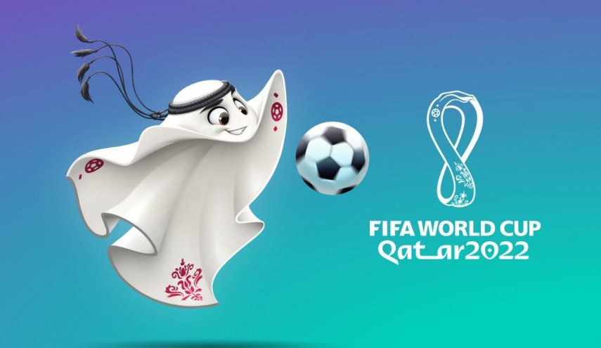
The moment we watched the draw ceremony for the group stage of the 2022 World Cup in Qatar to know the opponents of our country's national team in this tournament, the symbol of the 2022 World Cup was unveiled at the beginning of the ceremony, but at that moment, we did not realize that an Iranian designed it. has done. A symbol that soon appeared on social networks and even rumors about its nature were published; Some considered it similar to a ghost, and others considered it a "table of fish in the Persian Gulf", but none of these interpretations were true about "Laeib". Laaib in Arabic means a highly skilled player who invites all football fans to watch his techniques.
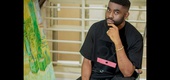
The important thing about this design is that an Iranian graphic artist designed it; "Syed Hossein Ajaghi" is the person whose name has been published in the media for the last few days and is introduced as the designer of the World Cup symbol. A special achievement for him, who was a "character designer" for many years, but now he has achieved a special and great success for the first World Cup in West Asia. In a conversation with "Zendegi Salam", he tells about the beginning of the story of this design, the contact of the Emir of Qatar with him, the challenges of designing this symbol, etc.
Since childhood, I loved painting
In the first question about when he entered the design profession, this young and talented graphic artist and illustrator says: "I loved drawing since I was a child, and in 2005 I took a specialized design course in Bandar Abbas. "Since 2011, I have professionally entered the field of character design and digital painting for animation and computer games." It is worth mentioning that he has collaborated in several serial and movie animation projects in the field of character and space design. Also, designing and implementing two comic book covers (comic strip) and designing sticker collections for several Farsi messaging programs are among his other activities.
FIFA sent me an email a year and a half ago
I ask him about when the story of designing the Qatar World Cup logo started, and he says: "The procedure for designing World Cup logos in previous periods, such as Brazil or Russia, which I have more detailed information about, was that FIFA had a competition between the designers they chose themselves. and among those proposed plans, he chose three that were approved by all their experts. Then FIFA would subject those three plans to public evaluation, and each one that got more votes would become the symbol of that era, and World Cup products would be produced based on the same symbol. In this context, it was almost a year and a half ago that I received an email from the Supreme Committee of the World Cup. This organization is a joint committee including FIFA and the officials of the World Cup host country, Qatar. In this email, it was mentioned that we saw your portfolio, it was approved and liked by us, so if you are interested, draw your proposed design as the symbol of the World Cup and send it to us."
My initial design was among the top 3 FIFA designs
This graphic artist says about the initial design he prepared for the Qatar World Cup symbol: "After receiving the email from the World Cup organizing committee, I declared my readiness to cooperate and then they also sent a PDF including what features the design should have, what criteria are important to them. And they tend to work on them and a series of standards and... I immediately started my proposal and finally presented them with an icon. That symbol was a falcon, which is known as the national bird of Qatar. I worked a lot on it in several stages, so to speak, I hammered it until it reached the final conclusion and it was decided to participate as one of the three final and best designs in the public vote organized by FIFA on its social networks. They said that based on these characters, animations will be made and the audience will vote for these symbols after watching the animation. This incident happened a year ago, and they were supposed to inform me of the results, but two months have passed since that incident and there was no news. I sent an email to the same committee saying that the host country of the World Cup opposed the public vote and apparently they have a plan and want to work on it as a symbol of the World Cup.”
Emir of Qatar wanted this symbol to be designed by me
"Ajaghi" receives an email from FIFA stating that "the country of Qatar did not accept any of the three designs and plans to design the World Cup symbol by itself, and this project stops here." He, who is probably disappointed in choosing his design as the symbol of the World Cup in Qatar after these events, continues: "Almost a month passed from receiving the reply to my email until I received another email from the head of the Branding Department of the Supreme Committee of the World Cup. It was mentioned there that we ourselves have an idea and we want you to work on it and complete its plan. Later, I realized that the Emir of Qatar personally has a proposed idea that was almost the same "Laaibi" that has been made now and you have seen it many times in the media in the last few days. They told me that the Emir of Qatar saw my designs and those of other designers and asked that this idea be implemented and finalized by me, because my Shaheen design was more attractive to him than the others.
This symbol is to introduce Qatari local coverage.
This character designer says about the nature of this symbol: "I signed a contract directly with the organizing committee of the World Cup to design the idea of Emir of Qatar and I started my work again 6 months ago. Their idea was that the black cap and ring that Qatari men put on their heads and is the local dress of the people of this country, become the official symbol of the World Cup in Qatar. They wanted to make the most of this World Cup opportunity and introduce this cover as a cultural symbol and a cover that is important to them and should be known in the world. They wanted this symbol to be seen visually so that all the people of the world know how Qataris dress, and apparently this issue is very important in the culture of the people of this country.”
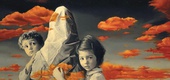
It was difficult to design the soccer world cup character without arms and legs
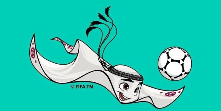
"Ajaghi" also says about the challenges of designing the symbol of the 2022 World Cup in Qatar: "I started designing this symbol in the circumstances I said, and for me, who is a character designer and had a lot of experience in this field for 15 years, this character was very challenging. When we want to design a character, we have a series of goals for its creation that must be considered in the design. In this regard, our character should have been a soccer player and this sport is full of movement and requires postures in which having arms and legs is very important to play with the ball, but when in the initial studies for this design, arms and legs I would say, it was not satisfactory. . The feedback I received from the Emir of Qatar about these studies was exactly the same, and he told me that this character and character should not have arms and legs and that goal should be achieved with this look, now you do something about it! Many etudes, hammering several times, communicating with the FIFA animators team on how to design movement for this character so that he can present a football show, finally arrived at a design that was desirable to all of us. We continued it and tried to make it better until it reached the final result, which was unveiled at the World Cup draw ceremony, and now you can see it."
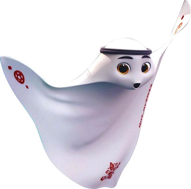
arabesque motifs on the symbol are designs of Qatari women's henna
This illustrator has interesting explanations about the motifs on this symbol and says: "After the initial design was finalized, I designed many decorations, motifs, etc. for it and considered many options and sent them to this committee so that their hands are open for the final choice. A series of them were very busy, and our preference was not to be so busy that it creates visual tension, because it might not create a good feeling in the audience. Until we decided to put two balls on the hands of this character, which we also took from the original World Cup logo that was released a few years ago, because this character was supposed to become this symbol from the same logo. The arabesque motifs that can be seen at the bottom of this character are inspired by henna patterns that Qatari women use as decoration and makeup. We wanted this character to be a symbol of both men's and women's communities in Qatar as the host country of the World Cup.”
I was interested in Amir Qatar's football skills and accuracy
Ajaghi, who was constantly communicating with the Emir of Qatar through his office and receiving his opinions, says: "The interesting point in the correspondence was his high precision and obsession. It is also important that he is a huge fan of football and tries to play a role in this field. For example, in the lower part of the design I used the art of Qatari women with henna, and FIFA insisted that the design should be more crowded. Finally, the Emir of Qatar said that the crowding at the bottom of the design makes the attention to be taken away from the white scarf itself. I had also told this to FIFA, but they did not accept it, and finally, when the Emir of Qatar said this, it was accepted. It was interesting to me that it is so accurate."
I am optimistic that we will advance from our group
Ajaghi says in response to this different question whether he is a fan of watching football or not: "I'm a football fan, but I don't play football and you know more about my interest in sports. About the national team group in the Qatar World Cup, since I was a child among the national teams, I really liked the games of the German and English national teams. Since we have good memories of playing against America in the past, I am optimistic that good things will happen to our national team in this period. Even now England is not the strong England of the past in the green rectangle and I think it is much easier than Argentina. All in all, I am very optimistic that we will advance."
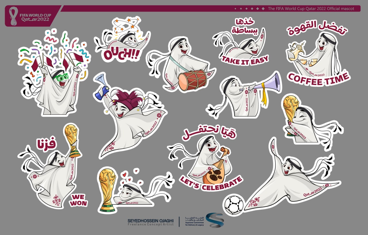
My work is not finished yet and there are still attractive stickers left
Although Laeib's design as a symbol of the 2022 World Cup has ended, the work of this Iranian graphic artist continues. He himself says about this: "My work is not finished yet. We are still working on the stickers of this symbol, and in the next few days, other attractive items will be added to the items that have been unveiled. Only its initial package has been revealed in the lottery ceremony. In the coming days, I will provide Laeib's stickers for social networks to FIFA and the Qatar World Cup organizing committee, who will publish them themselves."