


Introduction
A typeface is not just a collection of letters; it is a visual language that bridges the gap between text and the reader. Typeface design, as a vital branch of graphic design, plays a decisive role in visual identity, text readability, and even the psychological impact on the audience. A well-designed font can deliver a message faster and more effectively while evoking specific emotions.
Stages of Typeface Design
1. Research and Concept Development
Before starting the design process, the designer must define the purpose and usage of the typeface: Is it intended for long texts or headlines? Is it formal or casual? Digital or print?
At this stage, designers usually study historical samples (such as calligraphic scripts, Times New Roman, or modern sans-serifs) and analyze their key characteristics.
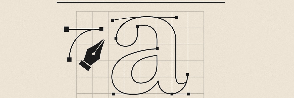
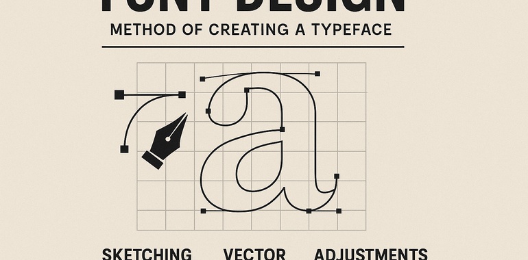
2. Sketching and Initial Design
Letters are first sketched by hand on paper or digitally on a tablet. The designer defines the basic lines, proportions, thickness, and rhythm of the characters. The most important principle here is consistency and harmony so that each letter fits seamlessly with the others.
3. Digitization
After sketching, the letters are recreated digitally in software such as FontLab, Glyphs, Illustrator, or FontForge. At this stage, details such as curves, angles, letter endings, and dots are refined with precision down to fractions of a millimeter.
4. Glyphs and Kerning Adjustment
A glyph refers to each individual character in a typeface. The spacing between letters (kerning) and line height must be carefully adjusted to ensure the text looks smooth and balanced when typed. Even the smallest spacing error can reduce readability.
5. Testing and Feedback
The typeface should be tested across different sizes and mediums: print, monitors, mobile screens, and web environments. These tests reveal issues such as poor legibility at small sizes or inconsistencies in long passages of text. Designers then refine the typeface based on user and peer feedback.
6. Naming and Identity
Every typeface needs a unique identity. Choosing a suitable name gives the font personality and makes it more memorable. Designers often create type families that include variations such as Regular, Bold, Italic, and more.
Aesthetic Principles in Typeface Design
Simplicity and Legibility: The primary goal of any typeface is to allow quick and effortless reading.
Proportion and Rhythm: Letters must be visually balanced and consistent.
Cultural Identity: Typefaces carry cultural values; for example, a Persian font should preserve elements of Iranian calligraphy while meeting modern requirements.
Innovation: Alongside tradition, creativity and originality set a typeface apart from others.
Conclusion
Typeface design is a process that combines art, engineering, and visual psychology. Every successful typeface is the result of hours of research, sketching, trial and error, and refinement. In today’s world, where text and visuals circulate rapidly in digital spaces, typeface design has become increasingly crucial, shaping how messages and brands are perceived and remembered.